

brand guidelines
Pikmykid Media Kit
Pikmykid is school safety, reimagined. We developed our platform to work with the technology parents and staff already have in their pockets and classrooms so every school can deliver a stellar experience in safety and efficiency.
our mission
Pikmykid is all about school safety reimagined
Building a passionate, egoless team is a responsibility we take seriously. Our mission is to ensure the safety of kids and drive a positive change in their communities by empowering schools with affordable technology. We know achieving this requires dedication and adaptability. And we’re ready and committed to see it come to life.
our vision
We empower schools to transform their daily & emergency operations with an easy-to-use platform
Many schools struggle with stressful safety and dismissal processes that cause confusion and leave students vulnerable. We empower schools to transform their daily and emergency operations with an easy-to-use platform. That way, everyone has peace of mind that students are safe throughout the entire school day and can focus on what really matters – learning.
We developed our platform to work with the technology parents and staff already have in their pockets and classrooms so every school can deliver a stellar experience in safety and efficiency.
our personality
Pikmykid is all about school safety reimagined
Pikmykid is the inspiring friend who helps you transform your life. Everything we do and communicate comes from a place of sincerity.
We believe in our mission and are compelled to help our customers transform their experience. To do that, we create real connections by acknowledging our customer’s pain points. We share the “normal” parts of our lives with them as well as the latest trends. We even help define new ones.


voice & tone
Our Voice Sounds Friendly, Genuine, Playful, Optimistic, Practical, Dedicated.
When writing for Pikmykid:
- We use humor to inspire, not to be snarky.
- We prioritize listening rather than knowing it all.
- We refer to students, kids & staff, not children & faculty.
- We offer expertise with confidence and respect.
- We engage in current conversations around safety without taking political sides.
- We refer to insights and reporting rather than data and tracking.
Logo use & guidelines
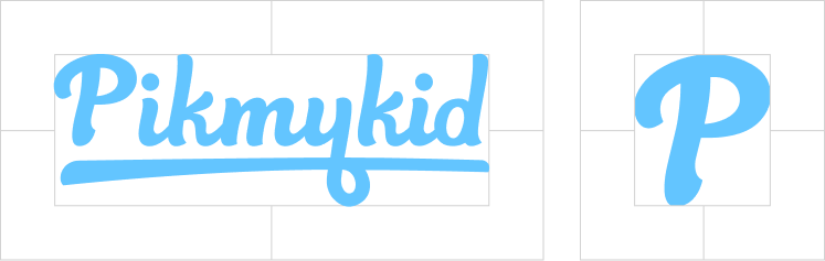
Logo
This is the primary Pikmykid logo and is used for all purposes of displaying the company’s brand. Our logo is only to be used in Bright Blue, White or Black if needed.
Favicon
This is the Pikmykid favicon and icon to be used when representing the brand at small sizes. It can also be used as an icon or graphic element. It is only to be used with the circle in Bright Blue and the P in White when used as the favicon. The P may be used as an icon or graphic element, but not to be used more than the wordmark.
Logo Misuse
The logo needs to remain consistent. Its composition, colors, and orientation must be consistent with the instruction in this guide. Under no circumstances should it be altered in any way.
Logo Spacing
The distribution of space around the logo is meant to be double on the vertical sides and half on the horizontal sides of the wordmark.
Logo Sizing
We want the logo to be legible at all times. The minimum size is 1 inch in print and is 96px on screen.

Logo On Color
The primary Pikmykid logo is always in either Bright Blue, White or Black. The background color is used to determine which of the two logos may be used.
When the logo is on Bright Blue it must be set in White. When it’s on Navy, it may appear in White or Bright Blue. When the logo is on Black, it may appear in White or Bright Blue.
When using the logo on any of the secondary or tertiary colors, it must always appear in White.
Icon On Color
The favicon is always shown in White with a Bright Blue circle. The “P” icon may be either Bright Blue or White prioritizing visibility depending on the background.
color palette
Our palette is broken down into Primary, Secondary & Tertiary Palettes, with specific use cases for each palette. Our primary color palette gains the most coverage throughout our designs. Our secondary color palette contains colors used sparingly or for specific purposes, such as for minimal graphic elements. Our tertiary palette is used mostly within the framework of app, platform and website design–used minimally as buttons, highlights or backgrounds.
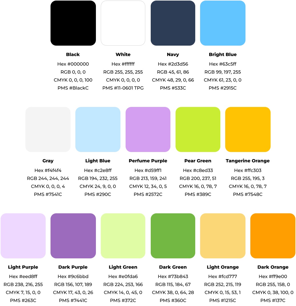
Primary Palette
Our palette is friendly, clean and positive. It’s used to represent ourselves cohesively across all parts of the brand.
Secondary Palette
Secondary colors are meant to be used sparingly as an accent or call to action. Gray and light blue can typically be found as backgrounds.
Tertiary Palette
Tertiary colors include higher and lower saturation versions of our secondary colors. These colors are used minimally as highlights or backgrounds.
what are color codes
There are different uses for colors within design. Each use has a different formula or code that works best (such as Hex Codes, Pantone Swatches, RGB or CMYK). Uses are outlined and explained below.
Hex Codes
This code is used mostly for website design and coding.
RGB
This stands for Red, Green & Blue. This is the ideal color code to use for screens. Use RGB when designing elements or images to be added to a website, or for materials that will be viewed on screens rather than printed.
CMYK
This stands for Cyan, Magenta, Yellow & Black. CMYK is used for print jobs where Pantone (PMS) matching is not necessary or available.
Pantone Matching System (PMS)
The Pantone Matching System is used for print items only. This color code is used when matching Pantone swatch colors.
typography
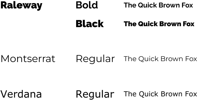
Type Stack
We use the sans serif typeface Raleway for headings and Montserrat for body copy. We mainly use Raleway Black for larger headlines and Raleway Bold for subheads. Montserrat Regular is used for all body copy. When neither Raleway or Montserrat are available, we use Verdana.
Type Scale
Headlines Should be set in Raleway Black. The case is sentence or title.
Subheads Should be set in Raleway Bold, in sentence or title case.
Body Copy Body copy is always set in Montserrat Regular.
All Caps These are mainly used for headers and buttons.
Company Name Must always appear in the same caps as the logo with an uppercase P and lower case text following.
photography
Photography Details
Our photography is highly people focused, specifically showing happy people. They are either looking at the camera or happily in the process of what they are doing. Photos may show either groups of people working together or individuals as well as a diverse representation of students, families, and staff. All photography is to match our brand personality elements of sincerity, friendly, optimistic, playful and dedicated.
We mainly focus on photos of parents, teachers, school administrators, and students. Students can be elementary through high school age and are mainly featured alongside adults. Most photos need to portray a positive experience.


Logo Use On Photography
The Pikmykid logo should be used in White when appearing on darker photos and Bright Blue when used on lighter images. The logo may be positioned horizontally only. Our Favicon can also be used on images in which a horizontal logo may be hard to read.
Make sure not to place the logo in a place the obstructs the main subject of the image.


